TypeSelf-initiated study, not a commission
ReferencesTwo CC0 photographs
OutputA banner proportion sheet
TimeTwo days
Question
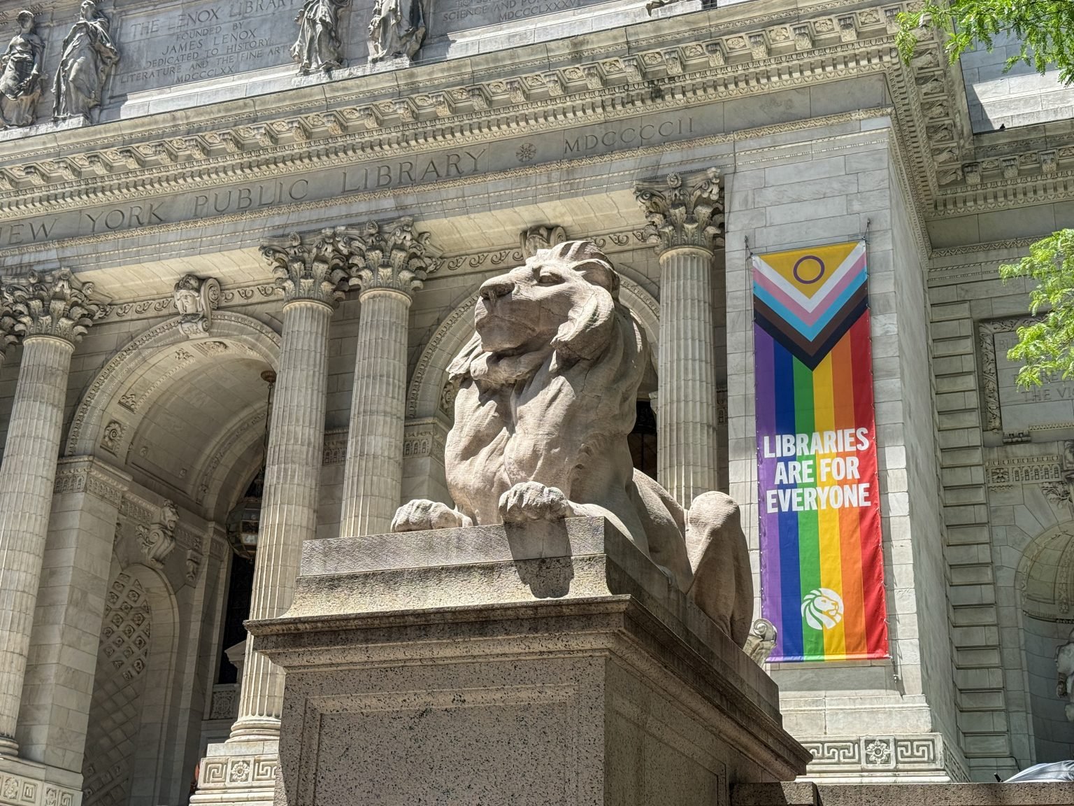
The building’s name is carved across the frieze in widely spaced capitals. It is permanent and reads best from directly across the street. The banner on the pier beside the entrance changes with the season and has to work at a glance from the pavement.
Study
We traced both from the photograph at the same scale. The inscription runs the full width of the front. The banner stacks three short lines of condensed capitals below a block of colour, with a small mark at the foot. Measured against the columns, the banner’s letters are taller than the carved ones, on a fraction of the width.
Kept
A one-page sheet relating banner width to letter height, and a rule: a temporary sign earns its place by saying less than the building around it. We check new sign drafts against it.